
Taking a More Minimal Approach

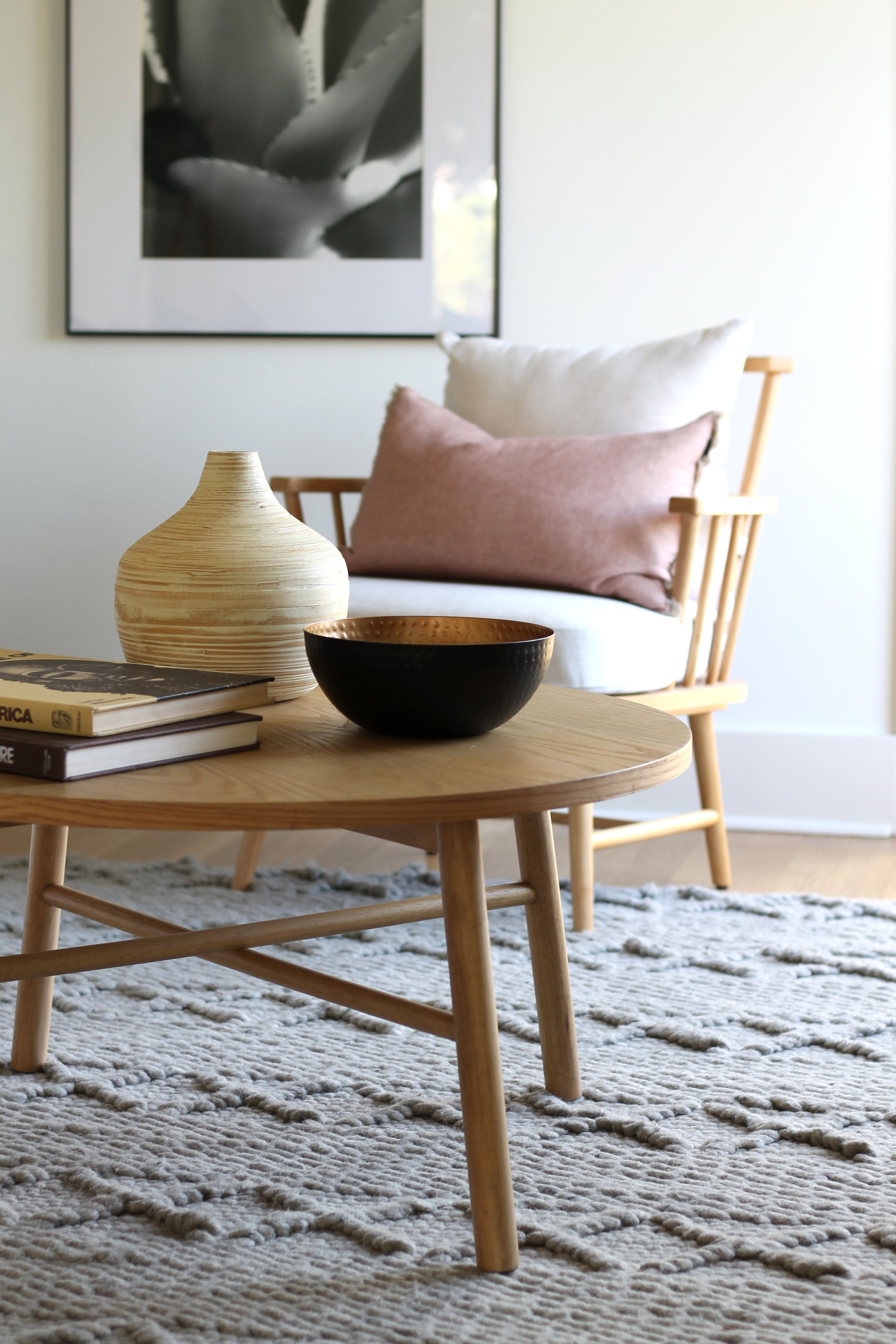
We’re always refreshing our outlook on the ever-popular transitional style of staging and design. Sure, its roots are simple, its color scheme neutral and its impact soft yet memorable. But sometimes we’re inspired simply by the home we’re staging to try tweaking that basic premise just a bit more. In this case, it was a Craftsman style home in trendy Silverlake, a part of Los Angeles. At the realtor’s suggestion, the homeowner had painted almost every surface in the home a pure white. What shone through was the home’s characteristic molding, double-hung windows and original fireplace. By stripping back the complication of darker molding, the home’s “bones” were exposed, giving us a perfect blank canvas to work with. A pair of Studio McGee for Target Taylorsville white oak chairs (no longer available) with spindle backs practically float on top of a super nubby gray rug we’ve dubbed “The Sweater” for its resemblance to our fave winter wear. McGee made the coffee table too, and our white linen Utopia sofa from Living Spaces anchors the room with its comfy heft. Custom-made mudcloth pillows and DIY stretched Kuba cloth art add that graphic punch. The light oak of a brass tripod lamp’s legs continues our light wood journey.
We knew our base color scheme was going to be a neutral one to honor this home’s history and to complement that creamy white. But going one step further, we introduced a soft blush — really only because we love it so much these days, and because it plays so well with black, gray, caramel and any other neutral to choose to throw at it. Terra cotta and blush are our go-to players in transitional homes.
It’s literally hard for us to pull back, assess, remove decor or minimally accessorize. It takes effort to do less. We wanted to add a spray of greenery to that vase on the coffee table. But after placement and a quick stand-back-and-look, we abandoned that idea. Now the hint of brass inside the bowl is made even more visible with no distractions. After all, the large B&W framed art behind it is of an aloe vera plant, so there’s the natural world represented right there anyway, right? There’s such beauty in a zen approach and we’ll be toying with this theory a lot more from now on.

More zen coming your way in the form of a pared-back dining room staging, featuring one of our fave dining tables (IKEA’s MORBYLANGA) and rich walnut wishbone chairs. We put down a softly patterned rug and added a rustic pine sideboard. Simple tabletop styling understands scale and proportion, while West Elm’s Morten lamp rests near a single urchin-shaped vessel. Note the lack of greenery sprays yet again. We practically have to tie our hands behind our backs to leave vases empty. But oh, how serene they look, almost beckoning to the home’s future owner to fill them. Sometimes the promise of something is even more intriguing than the thing itself. Did we just say that?

A fellow stager’s warehouse sale yielded this worn Asian bench, one of our most versatile and beloved pieces. We were thrilled that we had a bench the perfect size for this particular dining room wall. Above it, a striking B&W framed abstract packs the same punch as a larger artwork would, despite its size. To the right you can see the curved elegance of the stairs’ risers and treads.
When we spied an Urban Outfitters’ Marte chair for sale on Facebook Marketplace, you can be sure we jumped. Interest in this chair was great, so we made an appointment for pickup that very afternoon and within hours, she was ours! Similarly, the overdyed Persian rug in ochre, blue and terra cotta was an FB Marketplace score. Target’s rust stripe bedding continues this warm color scheme. Just add a palm plant in a rattan basket, some framed art (one from The Printable Studio on Etsy and one DIY) and you’re off to bed with a smile on your face in this primary bedroom.