a study in contrasts
 ometimes when we stage a home, we don’t exactly know what our color scheme will be. As we’ve blogged about before, sometimes a house just simply “spits out” what won’t work. This Elysian Valley home wanted to be decked out in black, white, warm orange and amber, with touches of subtle green. We tried out various more colorful pieces of art and pillows and ended up not using them. The large windows in each room served as art in themselves, augmented and enhanced by a neutral palette with hits of high contrast.
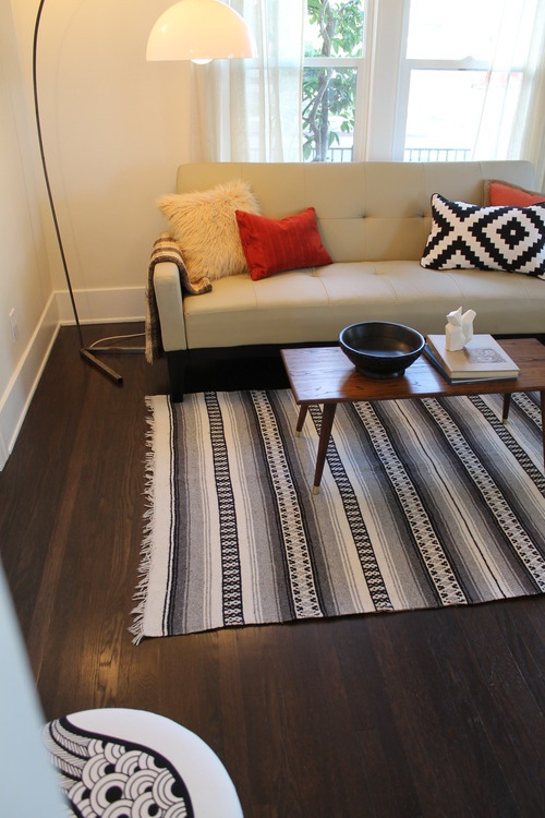
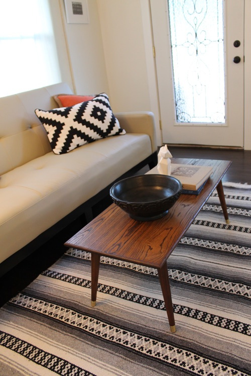
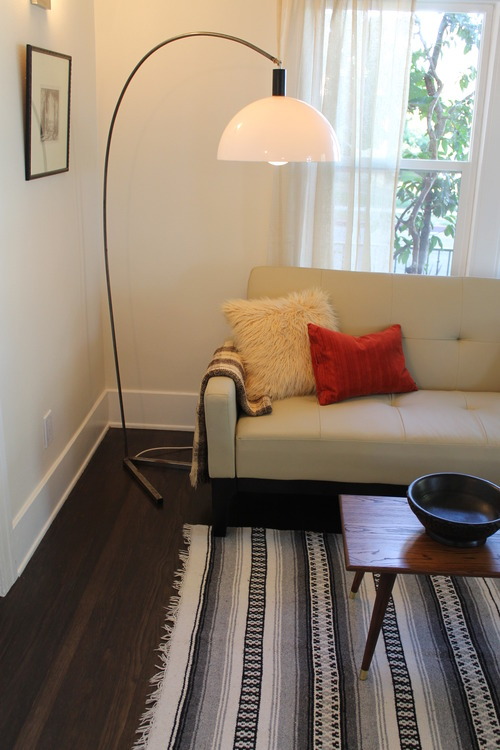
The living room features a neutral leather sofa with simple Mid Century modern lines and subtle tufting. We accented it with a Navajo style pillow and a Mexican rug. A clean-lined coffee table adds warmth. We used a white arc lamp for its neutral but eye catching detail.
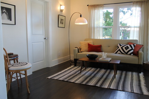
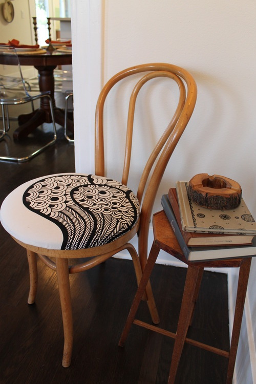
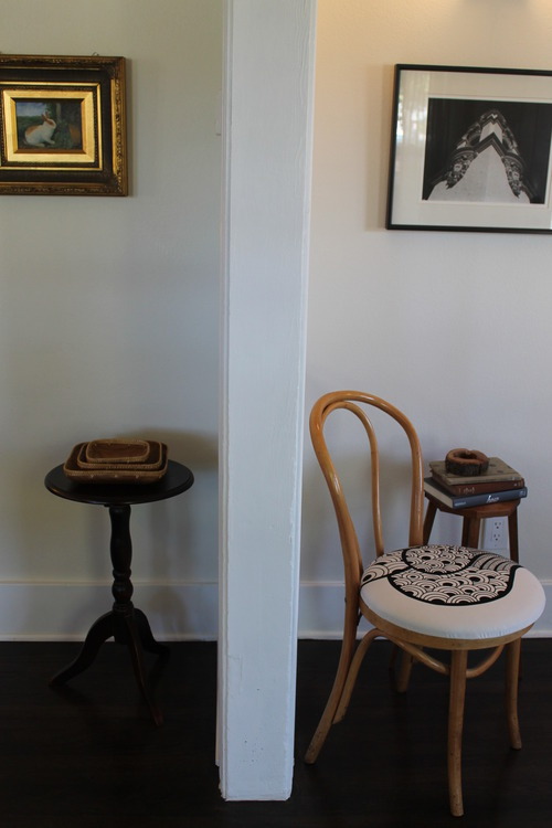
We tucked a bentwood Thonet chair in the corner along with a small vintage table. The B&W fabric on the chair’s upholstered seat echoes the rug and bold pillow.
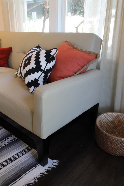
A closeup of the sofa. We love IKEA’s new line of Navajo-inspired pieces, like this pillow.
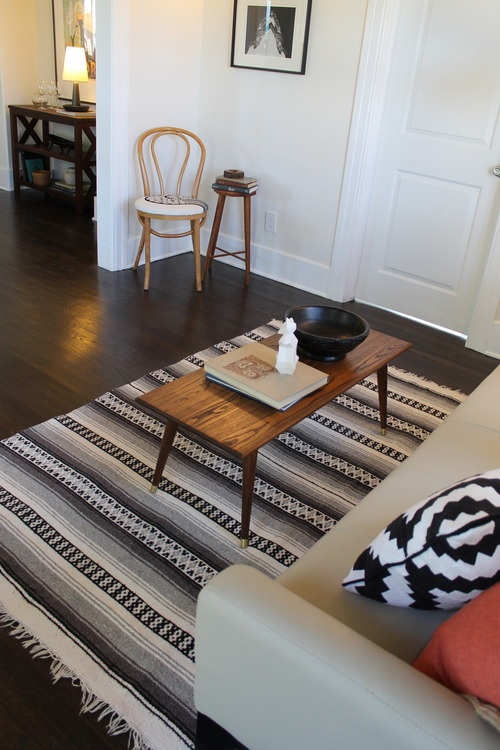
We found the log ashtray at a thrift store in Venice, CA. Super cute. In the background, you get a peek into the dining room.
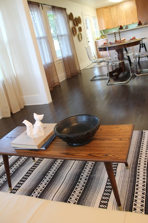
The Mid Century modern coffee table was sourced for $20 at a Silverlake shop and we had it refinished at Pepe’s Furniture in Echo Park for a refreshed look.
Two corners working together. The flip side of the living room corner was the perfect spot to put our beloved rabbit painting and a small pedestal table.
By swapping out our arc lamp’s previous bright orange shade for a white one, we’ve created a whole new lamp. A vintage wooden bowl, a faceted fox sculpture from Target and interesting books decorate the coffee table. The curtains throughout the house are from Nate Berkus’ new line for Target.
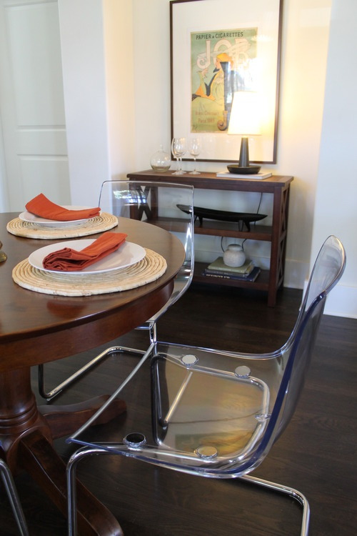
We paired a traditional wooden pedestal dining table with modern clear acrylic chairs. We set the table simply and highlighted it with russet orange napkins.
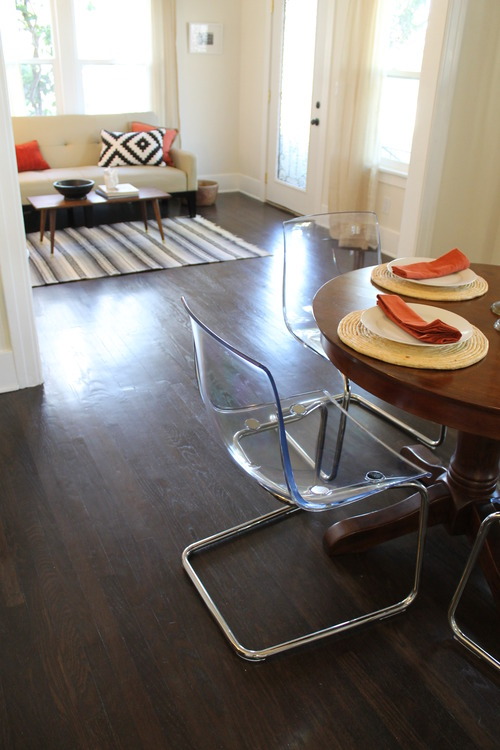
We love how the acrylic chairs (The TOBIAS chair from IKEA) seem to disappear and how they contrast with the table’s traditional lines and gleam against the dark hardwood floors.
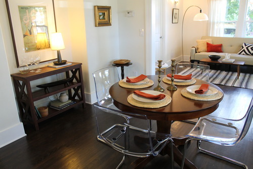
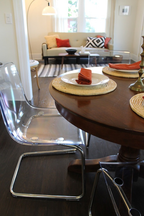
A pair of vintage brass candle holders brings a touch of warmth to the tabletop.
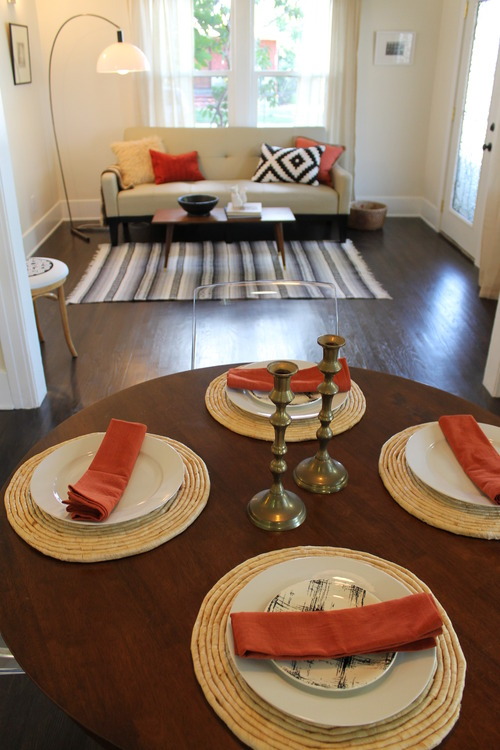
The large dining room pendant informed our choices of finishes in the room. Its warm wood tone dictated that we ground the space with a similar-finish table. This is an example of how fixed features in a home inspire our choices. Any other design direction just wouldn’t have made sense. This way, our design heightens the effect of existing fixtures that will stay with the home long after the staging comes down.
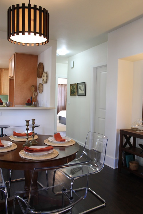
A view toward the kitchen shows the basket wall and the two DALFRED bar stools from IKEA which we pulled up to the breakfast bar. In the foreground, a closeup of the coffee table.
A sideboard in a matching wood tone is set into the dining alcove. It’s just the right height to hang a large Art Nouveau poster above.
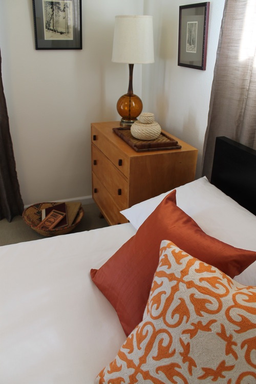
We carried the color story of russet orange into the master bedroom. Faux silk curtains in a taupe tone play well with others, especially this orange. A nubby throw inhabits the foot of the bed.
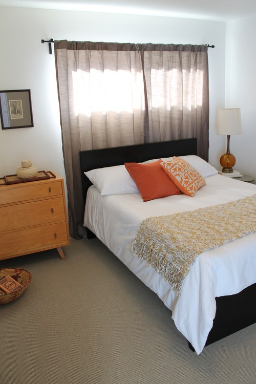
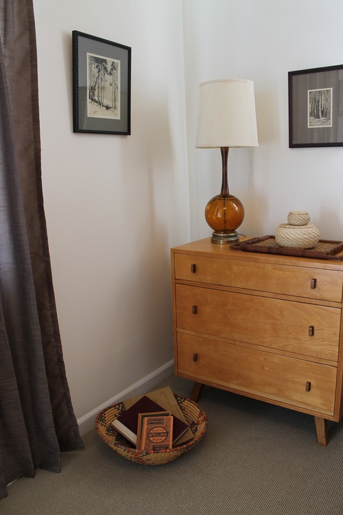
A vintage dresser and lamp finish out the space, and framed neutral-tone etchings soothe and calm. Simple baskets decorate the dresser top and an African basket holds a cache of books.
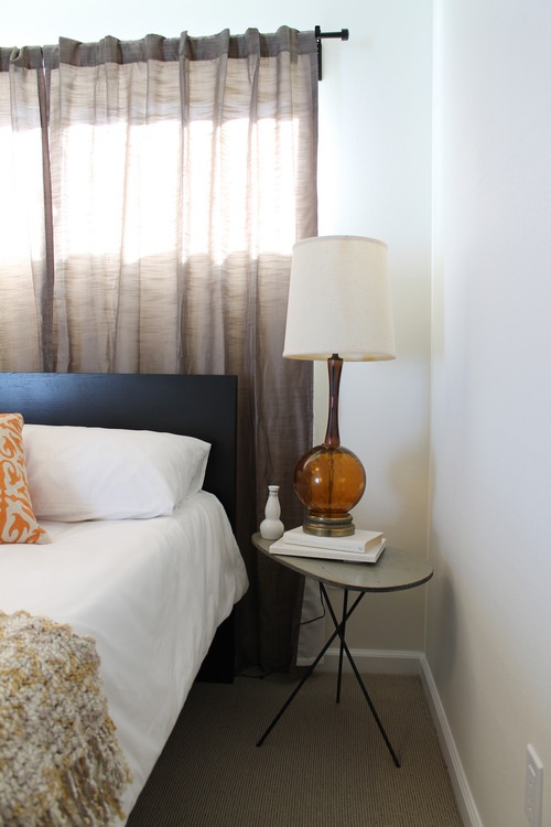
A modern tripod table and vintage lamp elevated by white books to one side of the bed (IKEA’s MALM).
We found the orange crewel work pillow at Home Goods. Its texture plays well against the solid orange silk pillow behind it.